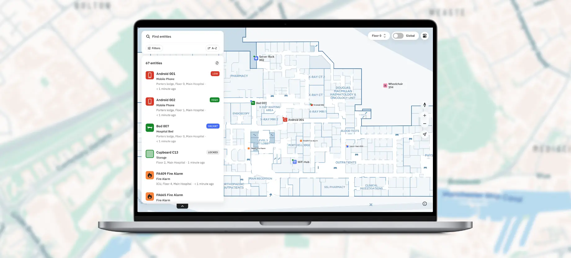
Turning a wayfinding map into an operational asset-tracking tool

Disclaimer: This project was undertaken during full-time employment at Living Map Ltd., and they retain all copyright ownership.
Project Overview
The first version of this application was largely based on our existing customer-facing wayfinding platform. This gave us a strong visual foundation and an established design system, but it also meant that many of its interactions were built around a fundamentally different use case - finding places rather than monitoring assets.

Once customers began trialling the product, their feedback highlighted areas that needed improving, while we also identified new functionality that would help flesh out the product and make it more useful as a dedicated asset-monitoring tool. I led the next stage of the product, bringing these insights together to improve existing experiences, introduce new features and adapt the application around the needs of staff.
Role
Lead Designer
My Responsibilities
Auditing the existing experience
Defining user journeys
Reworking key interactions and IA
Creating new and modified components
Adhering to existing design system
Collaboration with software developers

Understanding the Opportunity

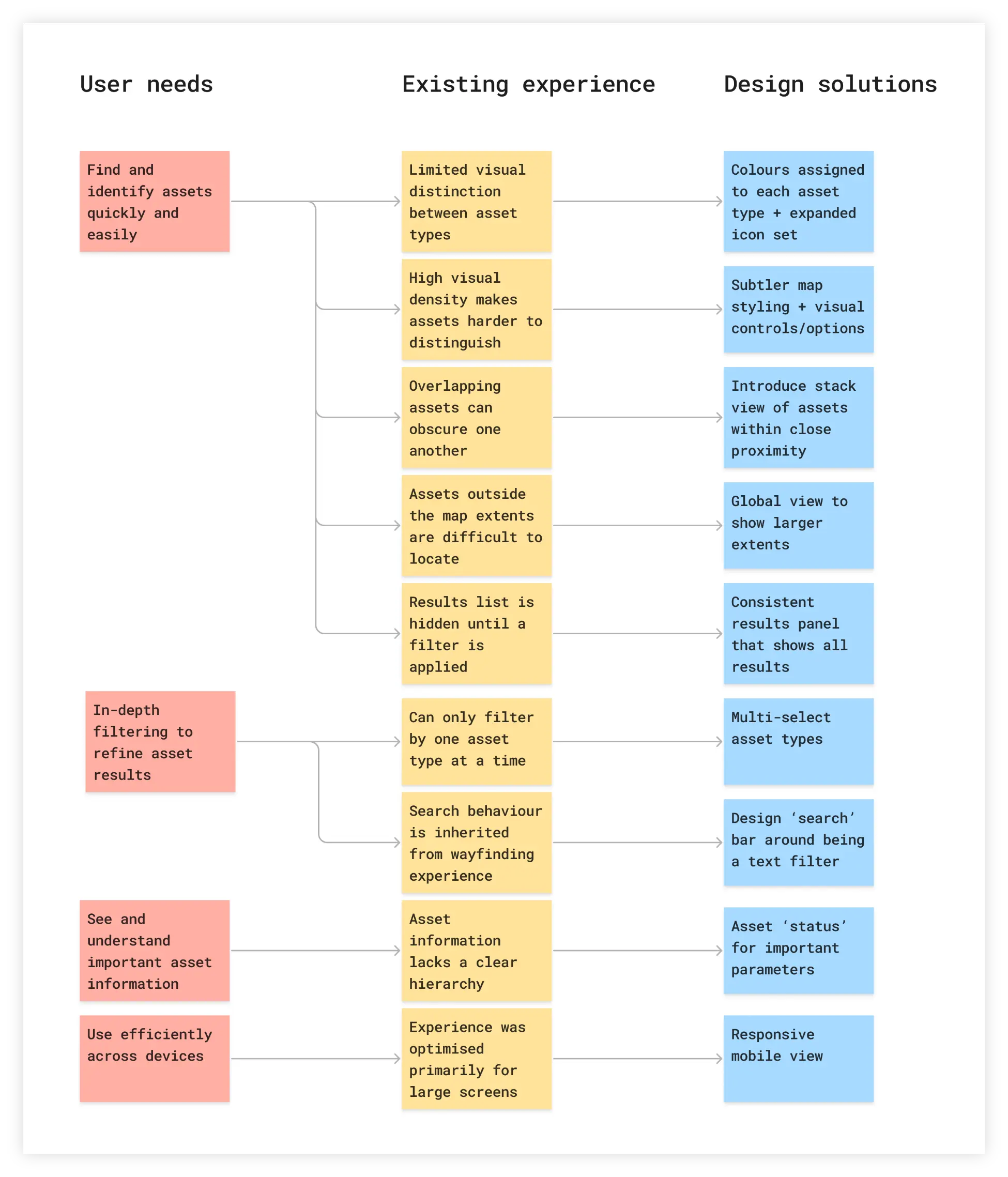
To understand where the product needed to evolve, I looked at the existing experience alongside customer feedback and the requirements of the staff-focused use case. This highlighted both areas that needed improving and opportunities to introduce new functionality, helping define the key areas of focus across asset visibility, filtering, information hierarchy and cross-device use.
Multiple screens showing the final design of the mobile app

Giving users control

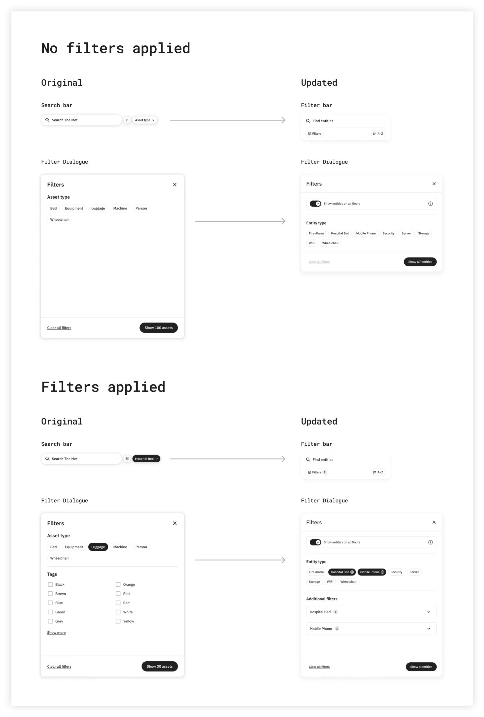
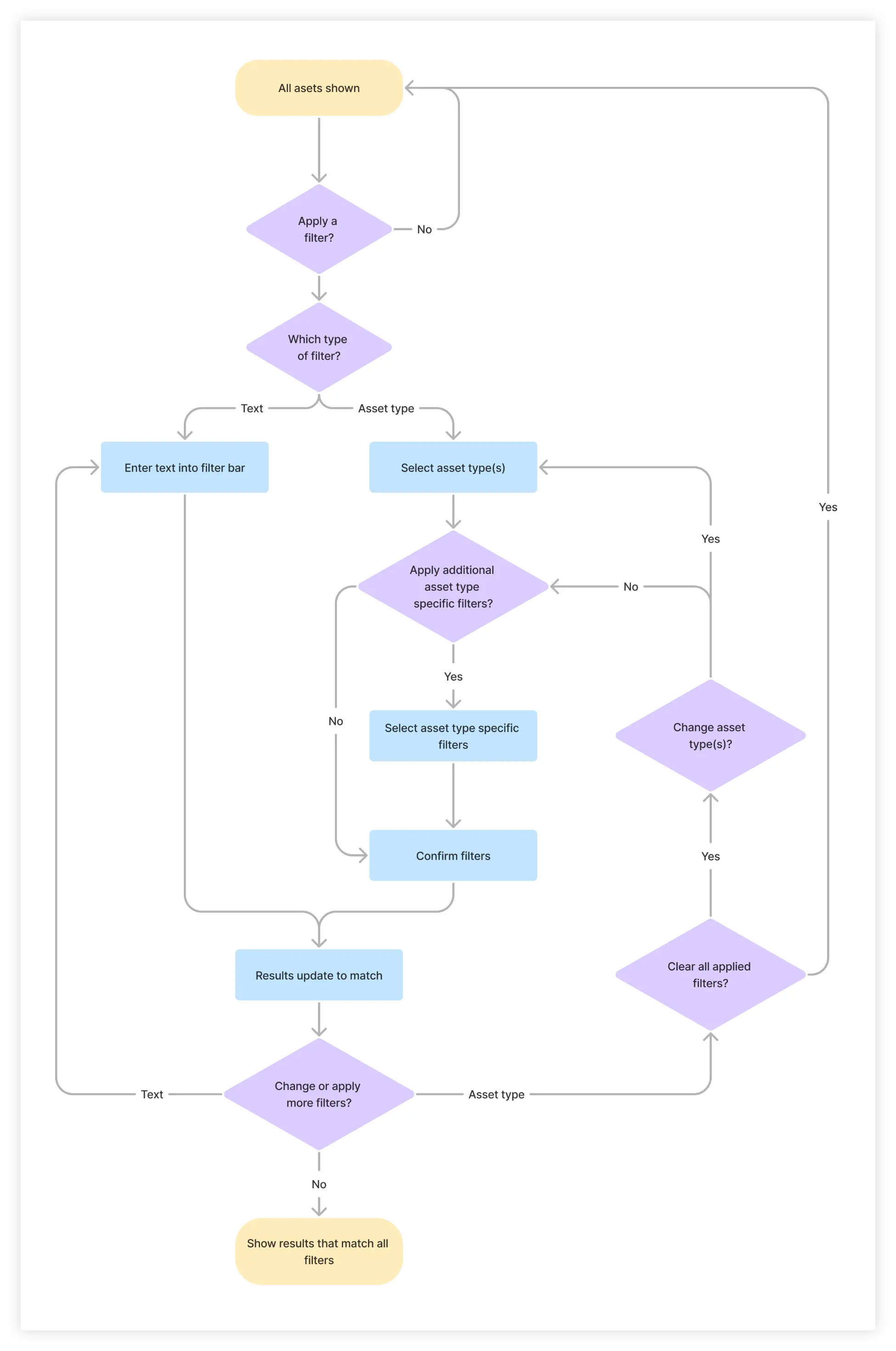
As the number of assets increased, users needed to interrogate the dataset rather than simply search for an individual entity. This meant the whole filtering system needed to be overhauled to give the users more control over what was shown.
Multiple screens showing the final design of the mobile app

Flow chart FOR APPLYING FILTERS

Multiple screens showing the final design of the mobile app

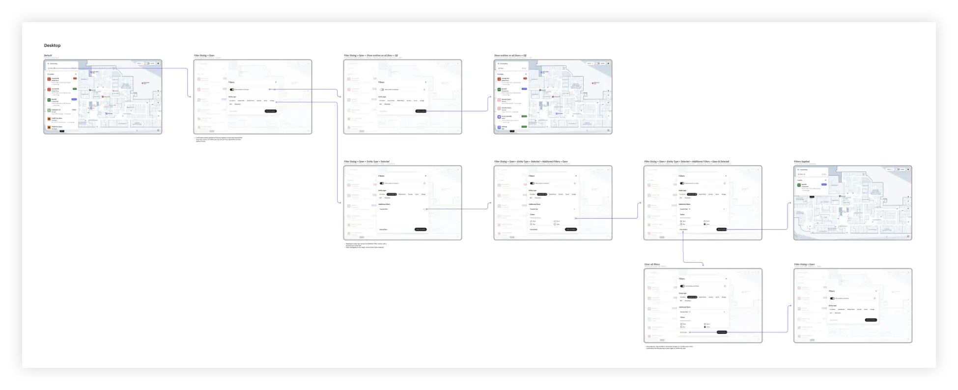
FINAL USER JOURNEY FOR APPLYING FILTERS

Multiple screens showing the final design of the mobile app

Comparison between the original and updated search & filter designs

Putting assets at the centre

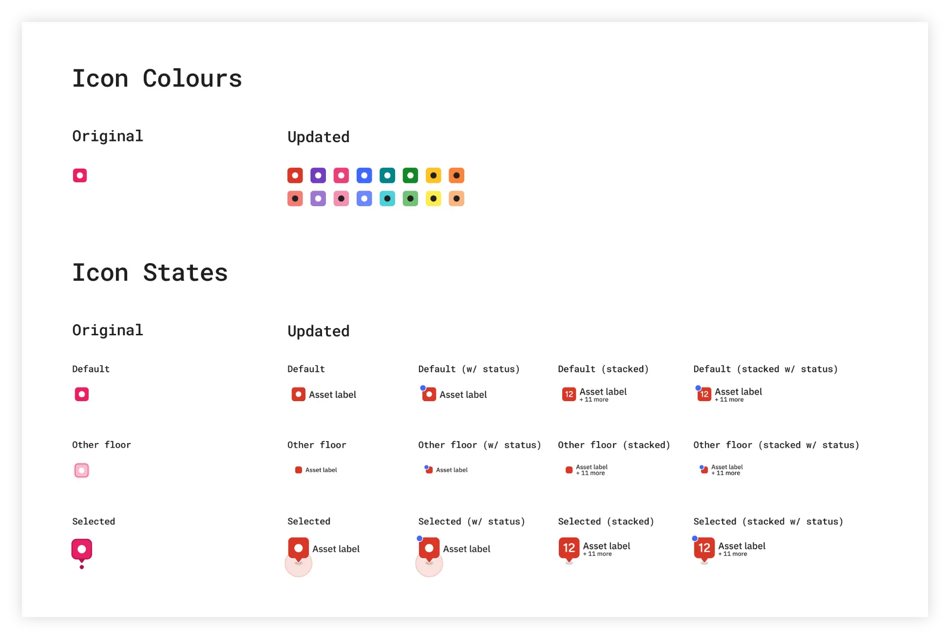
The existing map carried over a lot of visual detail from the wayfinding experience. I introduced clearer visual hierarchy, asset statuses and flexible map controls to reduce clutter and help staff focus on the information that matters.
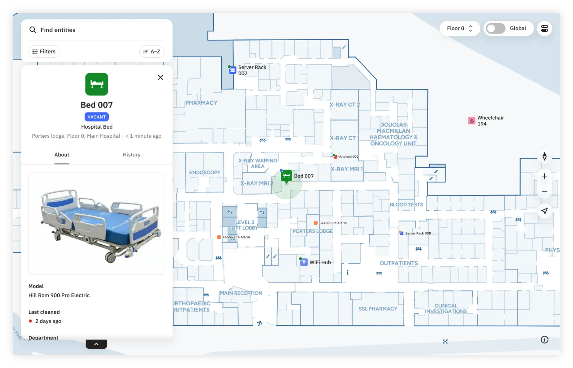
Multiple screens showing the final design of the mobile app

Comparison between the original and updated icons/labels

Multiple screens showing the final design of the mobile app

Selected asset - introduction of statuses, accuracy circles, & general ia improvements

Multiple screens showing the final design of the mobile app

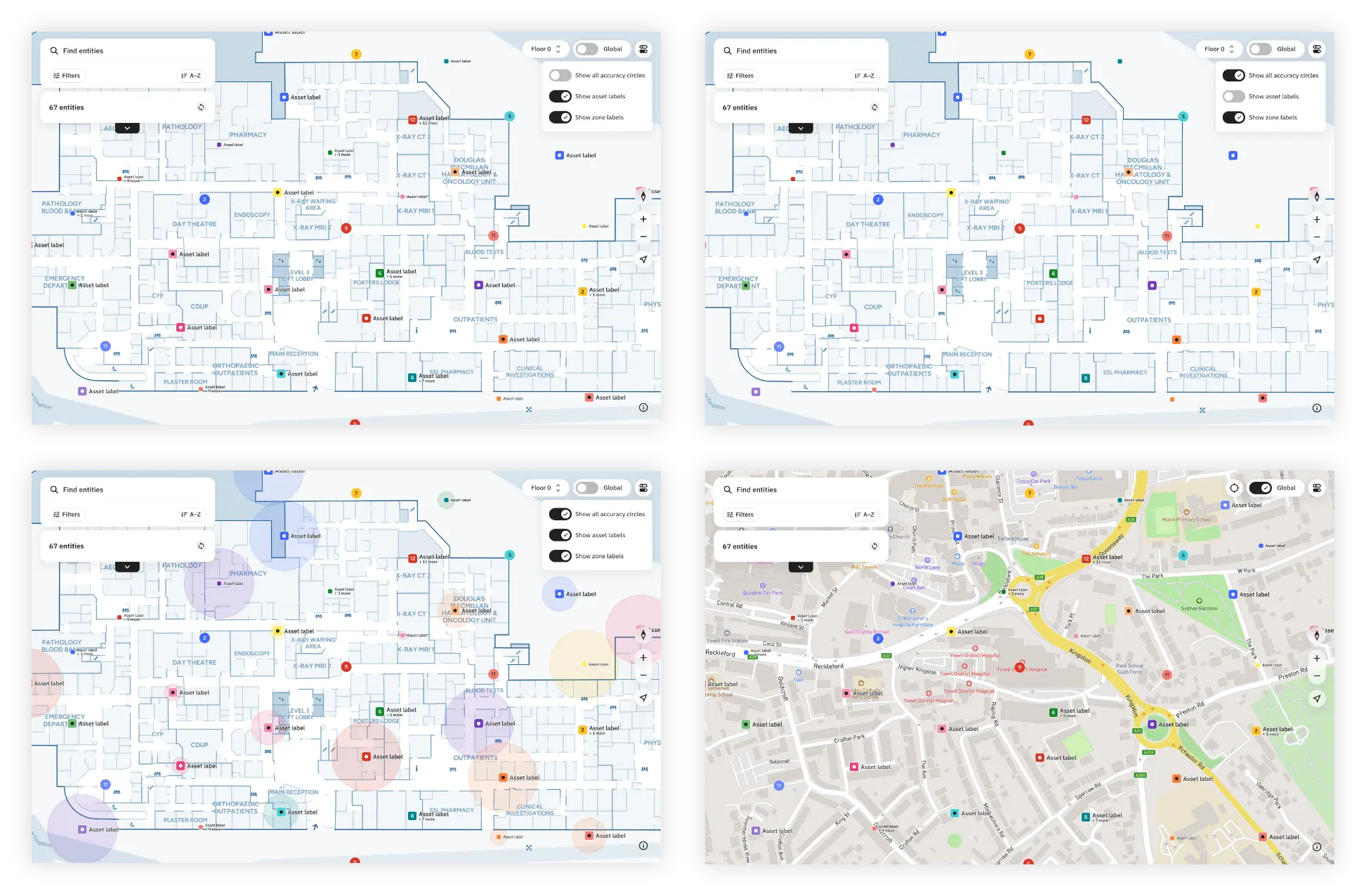
Map toggles - showing how the map view can be changed to suit the user's needs

Designing beyond desktop

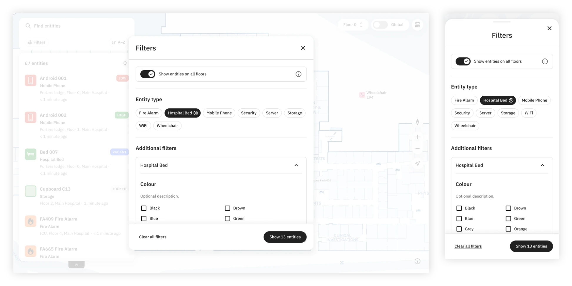
The original application was designed primarily for desktop use but we'd had many requests to make it more 'on-the-go' friendly, so I reworked the experience to adapt to smaller screens without compromising access to the map, assets or key controls.
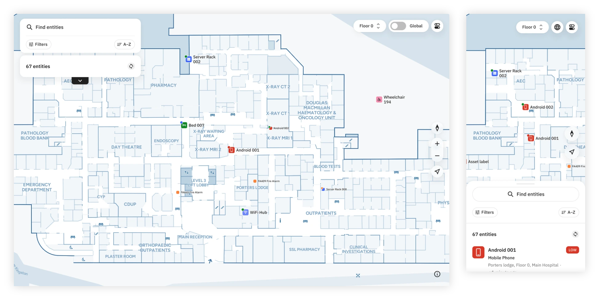
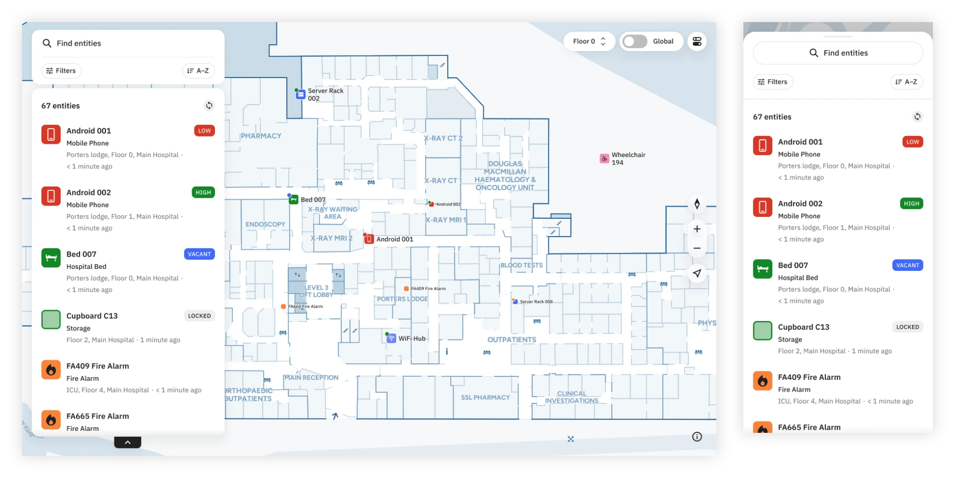
Multiple screens showing the final design of the mobile app

Responsive design - Default map

Multiple screens showing the final design of the mobile app

Responsive design - expanded results list

Multiple screens showing the final design of the mobile app

Responsive design - filter dialog